![]()
Killing the spreadsheet that cost a fortune
# The challenge of transforming a failed MVP into an intelligent tool that eliminates chaos and captures real business value.
At a glance
The challenge
I inherited a stalled MVP design that failed to address the real problem: users were managing high-stakes vessel downtime across multiple, conflicting spreadsheets. This process was creating significant data conflicts, masking the true financial impact, and represented a major source of revenue leakage.
My Role
Design Lead, partnering with Product Management and Engineering. I was responsible for all User Research, Product Strategy, Interaction Design, UX Writing, and Stakeholder Management.
The process
Stakeholder interviews, user research, interactive prototyping, moderated usability testing, and iterative beta testing.
The impact
Replaced the disparate 'shadow IT' workflow with a strategic tool that acts as a single source of truth. The new system prevents revenue leakage by intelligently capturing 'off-hire' events, enables root cause analysis for the first time, and transforms a multi-departmental dance into a calm, auditable process that provides immediate, actionable intelligence.
|
First things first: What is vessel downtime and why does it matter?
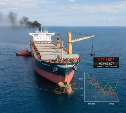
Before we get into the details, let's be clear about one thing: when a multi-million dollar ship stops moving, it becomes a gigantic, floating, and costly liability.. Every single second a vessel is out of action, known as 'downtime', it is costing its owner a fortune.
Depending on the contract, this financial pain comes in one of two delicious flavours. Either the person chartering the vessel simply stops paying their massive daily bill, which is known as going 'off-hire'. Or, the owner is still on the hook for all the voyage costs, like fuel and port fees, while earning absolutely nothing from the cargo.
And it's not always a straightforward, on-or-off affair. It's a delicate dance of partial off-hires, of 'massaging the figures' to keep everyone happy. A captain might speed up after a delay to make up time, but that burns a colossal amount of extra fuel and absolutely wrecks the ship's environmental rating. Every incident is a high-stakes balancing act between time, money, and reputation; a complex equation that the top brass care about deeply.
Either way you cut it, downtime is a catastrophic, balance-sheet-destroying nightmare. Understanding, tracking, and managing it isn't just a feature; it's a fundamental pillar of running a profitable shipping company.
And the existing process was manual and unreliable.
The challenge: Inheriting a box-ticking exercise
This project landed on my desk as a stalled MVP, and on the surface, it seemed simple enough. It was a basic downtime logger, a few screens in Figma designed to do one job: let someone in sales put a tick next to “Downtime Tracking” on a feature list.
But the problem was this. The plan was to give the house a quick coat of paint, when the real issue was it failed to address the systemic, underlying issues. The real work, the actual grown-up job of calculating costs and consequences, wasn't happening in our platform. It was being done on a highly complex spreadsheet that was a persistent source of conflicting information and manual data entry.

Image: The spreadsheet of doom. A nightmare of conflicting information and the single source of truth for a multi-million dollar operation.
The inherited form.
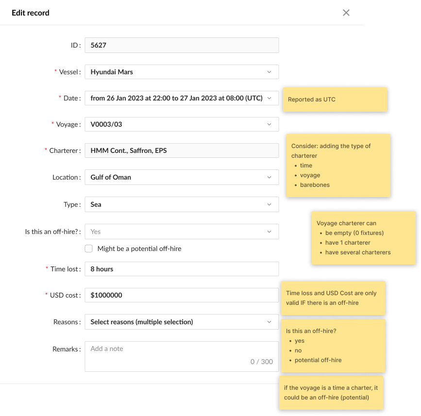
Image: The original, uncompleted design that I inherited.
The design I inherited asks a user to dutifully fill in boxes about dates and locations. And then, having fed the machine all this information, it simply gives up. It expects that same user, likely in the middle of a full-blown crisis, to suddenly become a contract lawyer and figure out the complex commercial consequences. The costings have no concept of the real world, of fuel, of catching up lost time. It’s a sketch.
And to be fair, you can see this wasn't finished work. You can see the yellow sticky notes, the unanswered questions, the raw ideas. This wasn't a failed design; it was an unfinished one. A project shelved and left to gather dust before it had a chance to become something useful
But this unfinished sketch wasn't just a bad design; it was a symptom of a completely flawed strategy. It became immediately obvious that my challenge wasn't to finish the paint job. It was to build a proper, intelligent tool that could kill that spreadsheet for good. Here’s the breakdown of why the thinking behind this plan was so fundamentally broken:
1. It produced useless data
The first and most obvious flaw was its reliance on a simple text box for the 'cause'. This is the design equivalent of throwing your hands up and hoping for the best. On one hand, you have to let a user describe what actually happened; an electrical fire caused by a burst pipe is not the same as just 'Fire'. But let everyone type whatever they want, and you end up with a thousand different descriptions for the same handful of problems. The data became inconsistent. It was impossible to analyse.
2. It expected the user to be a contract lawyer
The next glaring issue was the sheer burden it placed on the user. In the middle of an incident, with alarms likely ringing and people shouting, the system expected a Technical Superintendent to suddenly have the commercial knowledge of a high priced lawyer. It expected them to stop, go hunting for the contract, understand the legal nuances, and then come back and correctly flick a switch. It was a solution that placed an unrealistic burden on a user in a high-pressure context.
3. It completely missed the point
And this brings us to the final, most baffling problem. The MVP wasn't just disconnected from the platform; it was disconnected from reality. The entire point of tracking downtime is to understand the financial damage, but the proposed feature didn't even try to do that. The spreadsheets existed because they were the only things doing the actual, difficult job of calculating the final cost. It was a system that couldn't talk to itself, trying to solve a problem it didn't understand, forcing everyone to keep using the very spreadsheets it was supposed to replace.
The approach: From flawed MVP to actionable strategy
Faced with a plan that was clearly a dead end, the only sensible thing to do was to validate the brief and go back to first principles.
Instead of trying to improve the inherited design, I went back to first principles. This meant I partnered with the primary stakeholder to understand what they really needed. That conversation was the catalyst for the project's success. It confirmed a suspicion I'd had all along: the goal wasn't just to log downtime. It was to understand it. That single insight gave me the ammunition I needed to pivot the entire project away from the useless MVP and towards something genuinely intelligent. I took the original, chaotic 'logger' concept and broke it down into three, distinct, common-sense pieces:
- What actually happened? A proper record of the downtime event.
- How was it resolved? The steps taken to fix the problem.
- How much did it cost? The financial damage, clearly separated.
This new, more intelligent structure became the blueprint for the first working beta we put in front of the customer. Now, even with this better structure, we still had to follow parts of the original brief. This meant that crucial fields, like the 'cause' for the downtime, were implemented as simple free-text boxes. We knew this was a potential problem, but getting a working version into the customer's hands was the fastest way to get from a theoretical discussion to a real-world reaction. It was a strategy. We were building a better-structured version of the thing they asked for, so they could see for themselves the problems that remained. And, as it turned out, they saw them almost immediately.
Video: This was a fully interactive prototype built in ProtoPie. Its job wasn't to look pretty in a presentation; it was a tool for finding the truth. We conducted all our moderated usability testing remotely over Teams, using the 'think-aloud protocol', which is a fancy way of saying we got real users to tell us, without a filter, exactly what they were thinking. It's one of the fastest and most brutally honest way to discover if your assumptions are incorrect.

The design evolution: A brutal battle between perfect and done.
The customer started using the beta. And then, the feedback was immediate. They saw exactly what we knew they would see: that allowing everyone to type whatever they want was creating a source of inconsistent, unsearchable data. It was the feedback we had been waiting for. It was the irrefutable proof that, in places, the initial approach was wrong. And it was the green light to finally build the tool properly.
From a bewildering list to a strategic weapon.
The first problem we had to solve was the one we'd created ourselves. The original list of downtime 'types' was inconsistent and unusable. So we replaced it entirely. In its place, we gave the user two big, simple buttons at the very start of the process: ‘Planned’ or ‘Unplanned’. This wasn't just a filter; it was a key strategic shift. For the first time, it forced a crucial decision right at the beginning, allowing a superintendent to strategically schedule a repair for when the vessel is not on a time charter, saving a fortune.
From a vague guess to a pragmatic diagnosis
Armed with the feedback about the noisy data from our beta, we knew the simple 'cause' field was insufficient. But this is where you can easily fall into a trap. The customer, now understandably wary of free-text fields, went to the other extreme and asked for a complex, formal cause-analysis feature based on an industry method called MSCAT. A big, important-sounding acronym. A big, important-sounding job.
So, I started prototyping it. But I had this nagging feeling I’d seen it all before. It turned out, another team was building an almost identical feature for our HSQE module (Health, Safety, Quality, and Environment). This is where you have to stop and ask the simple question: "Why are we building a second kitchen when we already have one in the house?"
A bit of digging revealed the truth: the customer driving this whole request wasn't actually using our shiny new HSQE module. They were using a competitor's. They were asking us to rebuild a feature they already had in a different system, simply because our platform couldn't talk to their other toys.
And that's when the penny dropped. The problem wasn't just about finding one right way to capture the cause; it was about serving two different needs. The Superintendent in the middle of a crisis needs to log the problem quickly and cleanly. The analyst back in the office needs to do a deep, forensic investigation later.
The solution, then, was a pragmatic, two-part system.
First, for the immediate report, we landed on a much smarter model: two clear dropdowns for the ‘Incident/Consequence’ and the ‘Immediate Cause’. It gives the business the clean, analysable categories it needs for high-level tracking, without creating unnecessary friction or administrative overhead.
Second, for the deep analysis, we gave them a simple link. Instead of wasting a fortune building a redundant feature, they could add a URL to their downtime report, pointing directly to their own detailed safety reports in their own HSQE system. Suddenly, the financial story and the forensic story were connected into a single, unbroken narrative.
Video: I built and tested a prototype of this complex, four-level hierarchy. While technically clever, it was obvious it would be a nightmare for a user under pressure. This is a perfect example of a feature we killed, proving that the simpler, more pragmatic solution is almost always the right one.
From a shopping list to a proper ledger
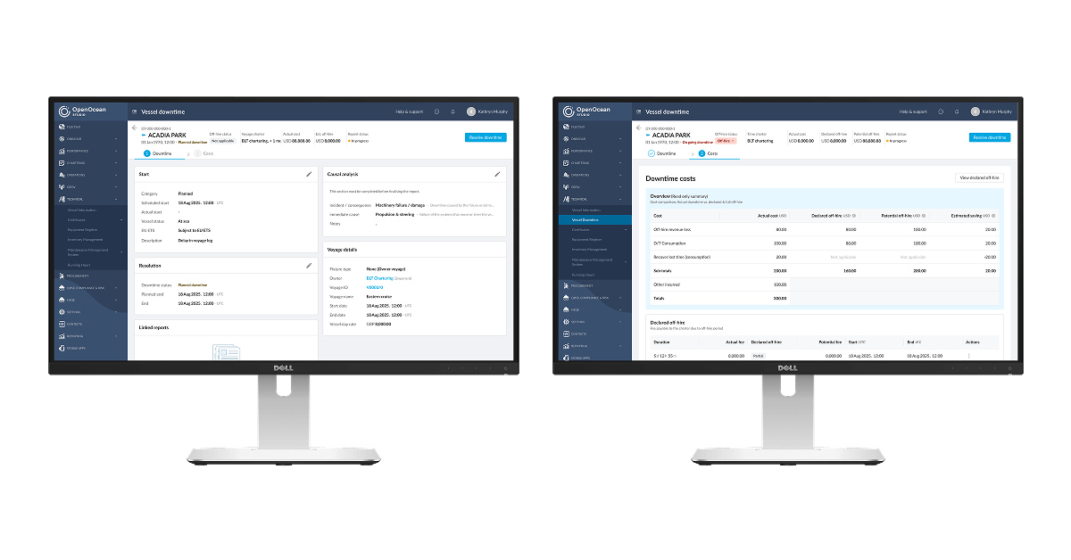
It was the same story with the costs. The first beta proved that a simple shopping list of numbers was useless. So, we turned it into a proper financial tool. By creating a simple, structured, two-level model, the user now specifies the 'Type' of cost, like 'Port Costs', and then the specific 'Item'. It’s proper financial control, born from the ashes of a feature that was not up to the job.
The outcome: From a dumb form to a strategic asset
So, what was the result of all this common sense? In short, we took a stalled, pointless feature and turned it into a genuinely strategic asset for the entire business. Here’s how.
For the poor soul actually using it:
-
Their administrative headaches are gone. What was once a tedious, after-the-fact reporting chore is now a simple, fast, and intuitive tool they can use in the middle of an incident.
-
They can make better decisions, faster. The clear categorisation means they can see immediately if they're dealing with a new problem or a recurring nightmare, right at the point of entry.
-
It helps them prove their own value. For the first time, an operator can use the clear, structured data to highlight to leadership exactly how much money a smart, timely decision has saved the company. It’s an evidence locker for their good work.
For the people in charge of money:
-
It stops the company from losing money. By automatically flagging potential 'off-hire' periods, it ensures every valid claim gets captured. The clean data also means fewer arguments with charterers and, crucially, faster payments.
-
They can finally run a proper maintenance strategy. The Head of Technical can now ask, "What was the total cost of purifier failures on our K-Class vessels last year?" and get a real answer. This means smarter purchasing and fixing things before they break.
-
The bean counters have proper financial control. They get a granular, real-time view of incident-related spending. This allows for accurate accounting and, for the first time, a clear picture of the true cost of things going wrong.
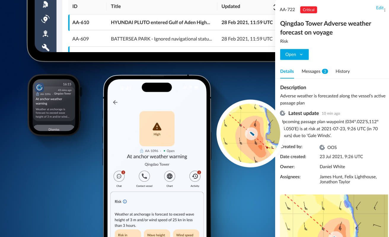
Image: Behold the spreadsheet-killer. A single, intelligent screen that does the work of a hundred frantic emails. This is what clarity looks like.
And what about the numbers? The cold hard data?
Now, at this point in the story, I’m supposed to show you a series of complicated graphs. I’m supposed to bombard you with acronyms and dazzle you with percentage points that prove, with mathematical certainty, that I am a design genius.
Well, I’m not going to do that.
Partly, this is because we were in a high-speed battle to deliver value, and the leadership team made the perfectly sensible decision that our time was better spent building the next feature, rather than navel-gazing at the last one.
But the main reason is this: enterprise software, the serious, grown-up stuff, is notoriously difficult to measure in a way that isn't completely meaningless. You can't just slap the same metrics you'd use for a social media app onto a tool that manages a multi-million-pound shipping operation. It's idiotic.
For instance, some people would tell you to measure "Weekly Active Users." But think about it. This is an airbag. It's a tool for reporting a crisis. If we had a high number of active users, it would mean our customer's entire fleet was constantly on fire or breaking down. High engagement, in this case, would be a catastrophic business failure. It’s a useless metric.
Then they'd tell you to measure the "Average Time to Completion." An average of what, exactly? The time it takes to report a small fuel leak versus the time it takes to report a full-blown pirate attack? The complexity of every incident is wildly different. An "average" time would be a meaningless number, a statistical lie that tells you nothing at all.
So, instead of chasing these useless figures, I had a framework ready that focused on the stuff that actually matters.
-
First, I'd measure the Handoff Delay. The real enemy in any big company is the time a task spends sitting idle in someone's inbox. I'd have measured the gap between one department finishing their job and the next one starting.
-
Next, I'd surface the External Bottlenecks. The tool had a feature for logging when you were waiting for an external party. The metric here isn't to reduce the wait; it's to visualise it. For the first time, the top brass would have seen a graph showing their projects spend 45% of their time waiting for someone else.
-
Finally, I'd track Communication Overhead. I'd use surveys to prove that our tool was killing the endless, chaotic email chains that were slowing everything down.
So no, I don't have a PowerPoint full of charts. What I have instead is a product that delivered immediate, tangible value, and a pragmatic understanding that sometimes, the most intelligent decision is to stop measuring and start building.
Putting it all together: A tale of synergy, not silos
This is where the real magic happens. All those clever design decisions come together to transform what was once a chaotic, multi-departmental, reactive process into a calm, streamlined, and auditable process. Here’s how a crisis plays out now.
Scenario: An engine part has a tantrum in the middle of the ocean.
14:30 UTC – The event: The Technical Superintendent gets a report of a critical failure. Instead of frantically firing off emails, he calmly opens the Downtime module. He selects the ‘Incident/Consequence’ as ‘Machinery’ and the ‘Immediate Cause’ as ‘Main Engine Failure’. It takes him 30 seconds. A perfect, structured data point is created before anyone has even had time to panic.
14:31 UTC – The operational response: The Operations Manager gets an instant, automatic notification. They see the real problem, not a vague email. They immediately instruct the port agent to 'Stand down pilot', preventing a fat bill for a service that's no longer needed. Money saved, just like that.
14:35 UTC – The commercial consequence: The event automatically appears on the Chartering Manager's dashboard, already intelligently flagged as ‘Potential Off-Hire’. They have all the evidence needed to build a clear, indisputable claim. No more arguments, no more hunting for information. It’s all just… there.
In the space of five minutes, one person's guided entry has provided immediate, actionable intelligence to the entire business. What used to be a mess of phone calls and conflicting spreadsheets is now a calm, efficient, and completely auditable process.
The future: What all this cleverness unlocks
The best part about building an intelligent tool is that it doesn't just solve today's problems. The rich, structured data we're now collecting is a goldmine, and it opens up some properly exciting opportunities for the future.
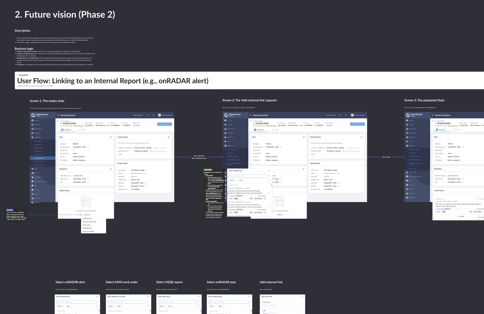
Image: A blueprint for the future.
-
We can start to predict the future. With enough data, the system can learn to spot the warning signs of a potential failure before it happens. It’s the difference between an engine exploding on the motorway and a warning light telling you to book a service next week.
-
We can create a performance league table for the ships. The system can automatically benchmark the entire fleet, showing everyone which vessels are the reliable workhorses and which are the expensive hangar queens. It’s brutal, honest, and incredibly useful for making big financial decisions.
-
We can automate the most tedious paperwork. The platform could be taught to automatically generate draft 'off-hire' claim statements, complete with all the evidence. It would turn a slow, argumentative process into a simple click of a button.
-
We can connect everything into a single, unbroken story. This is the real prize. The ability to connect the entire process end-to-end. From the initial downtime log, through to the repair tasks, the procurement of new parts, and the final invoice. That's the true power of a single platform over a dozen separate, bickering tools. It’s the end of chaos.